PACKAGING REDESIGN
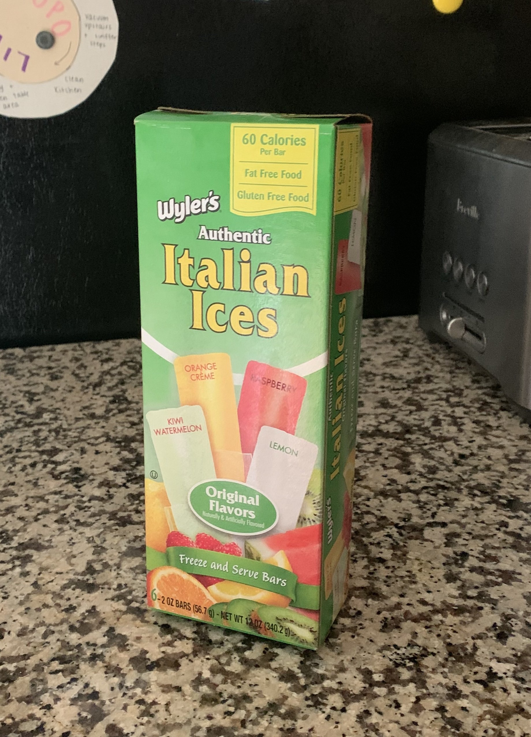
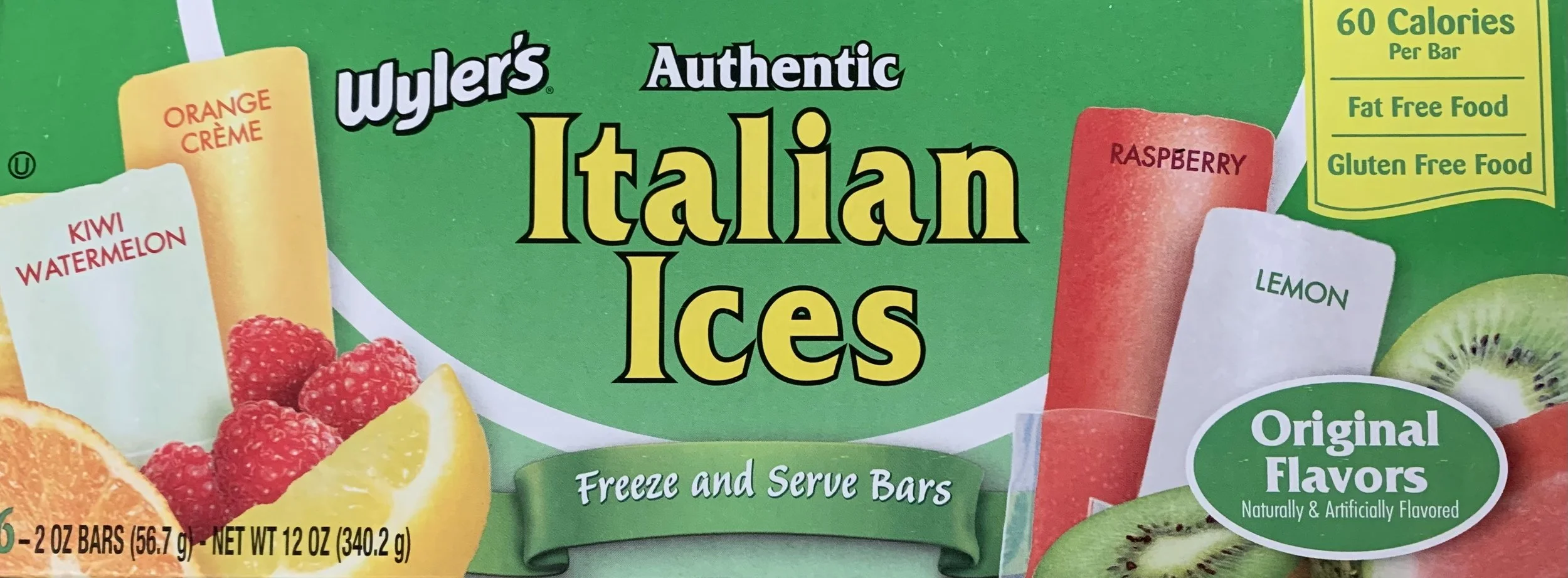
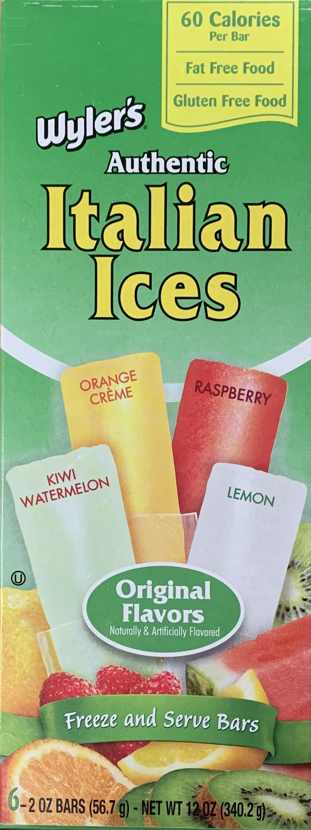
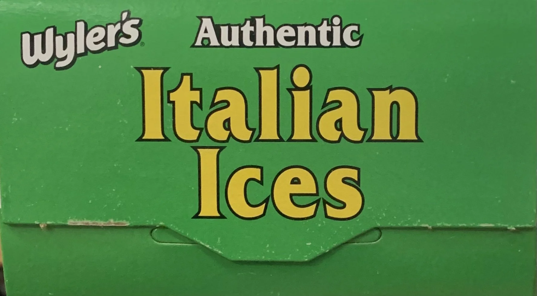
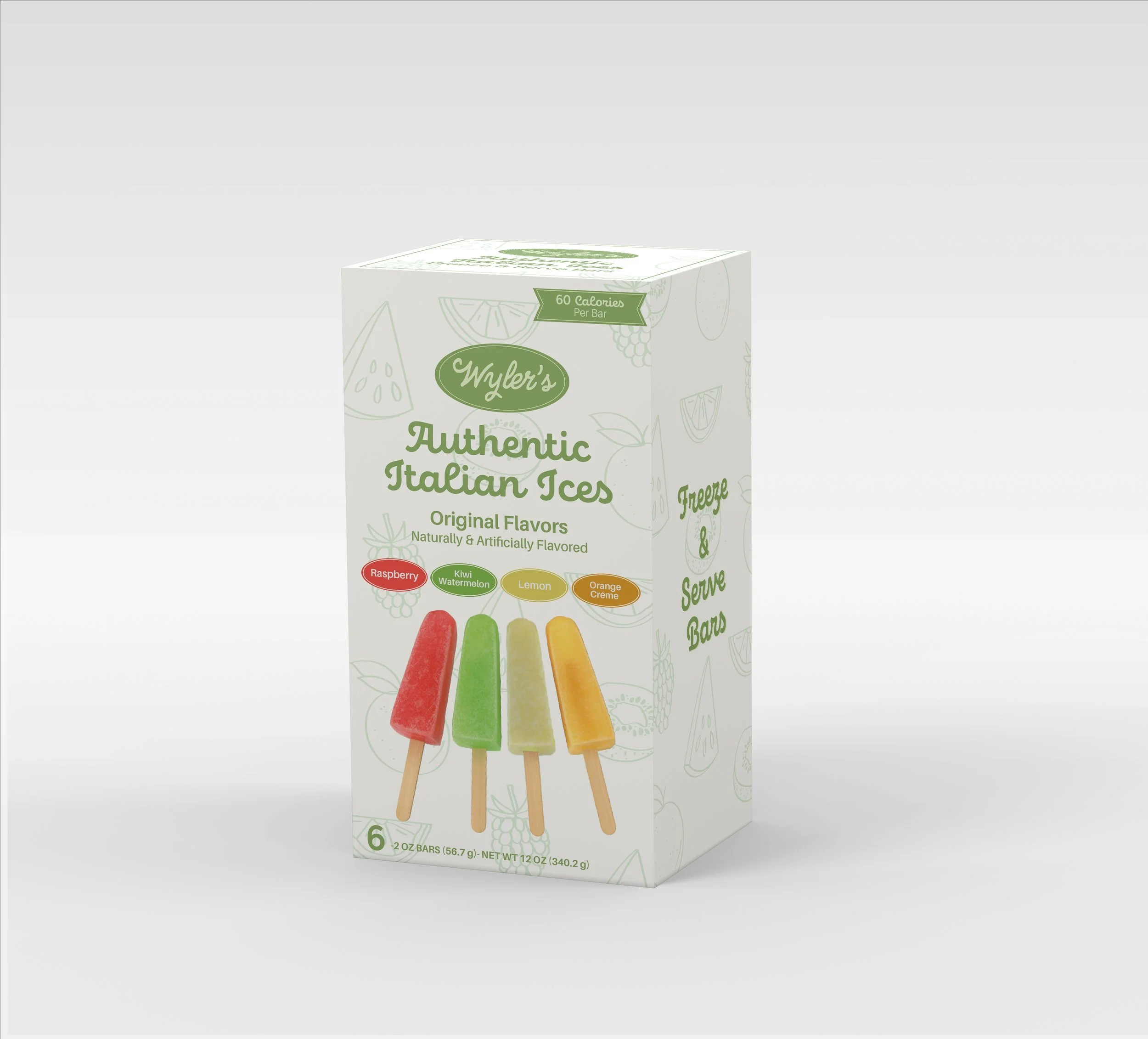
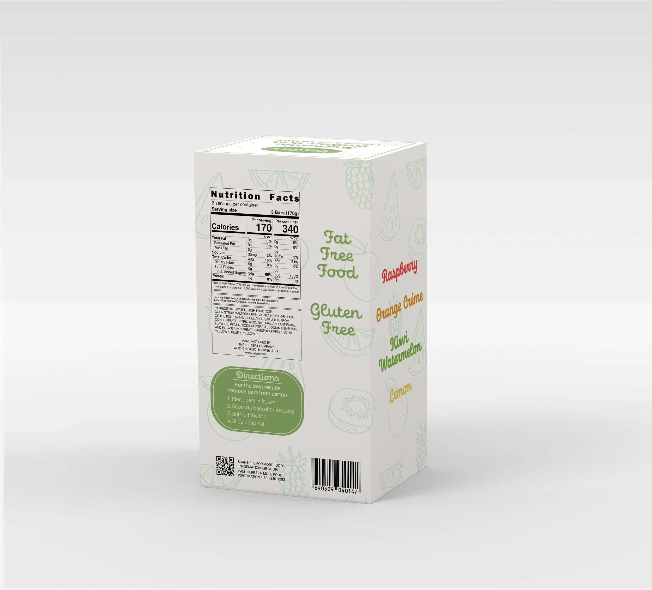
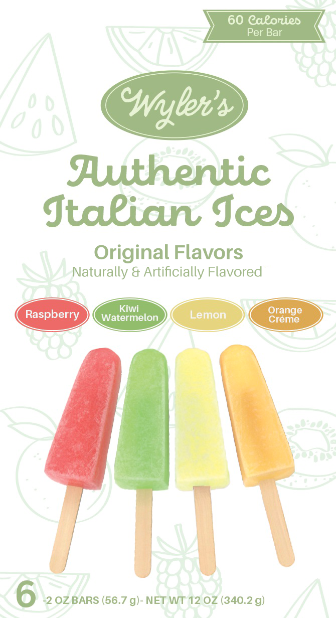
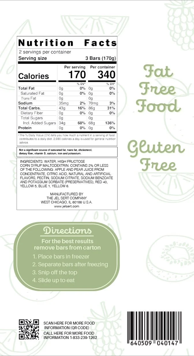
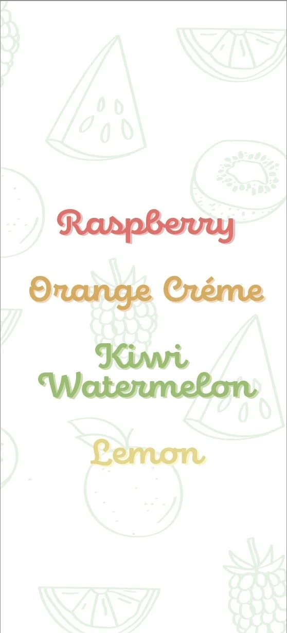
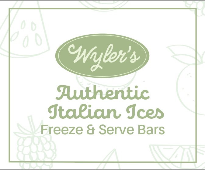
I took on the challenge of redesigning the packaging for Wyler's Italian Ice, a product I found on the shelves at Dollar Tree. The goal was to modernize the packaging to enhance visual appeal, improve the brand identity, and make the product stand out on the shelves while using all of the same information and text on the box.
ORIGINAL PACKAGING
MY DESIGN
-
I wanted to make the design more modern and targeted towards a larger audience. I simplified the design with a pastel color palette. I also simplified the typefaces to only 2 instead of 5 to a playful script typeface and sans serif typeface. I illustrated a fruit pattern to make the packaging seem more genuine and unique.

